

The One Thing That’s Different About 2022’s Bear Market
One of the first things they teach you in the unofficial Personal Finance Classics canon of required reading is that every time things look like they’re going awry, people will insist, “This time, it’s different. This time, we’re not coming back from it!”
Every author cautions against falling prey to this mix of seductive pessimism and the 24-hour news cycle by reassuring you that No, in fact, “this time” isn’t different.
That’s all well and good when you’re reading those words during a historical bull run. “Totally,” you may find yourself thinking, “I’ll definitely outsmart all these people who lose their cool and believe we’re somehow living through something special or novel!”
“It can create feelings of uncertainty and fear about whether or not continuing to invest or “staying the course” is the right move, or if we should go against our better judgment and start deviating from the plan. ”
…Until it starts to feel like you are living through something special and novel, and, oh, by the way, everyone who seems intelligent enough to have a worthwhile opinion on the matter seems to think so, too.
It is—in a word—disorienting, and it can create feelings of uncertainty and fear about whether or not continuing to invest or “staying the course” is the right move, or if we should go against our better judgment and start deviating from the plan.
The bears (and those who simply insist this time is different) have compelling logic to suggest the underlying conditions we’re facing now have changed, and therefore we should expect different outcomes in the future than in the past.
Fair enough, right?
What’s supposedly different this time?
I wanted to identify a few key metrics I see frequently pointed to in the media as proof things are different now. I ended up with three primary symptoms we point to as evidence of problematic “now” times:
Overvalued markets (i.e., stocks being at all-time highs), as measured by the Shiller PE (or “CAPE”) ratio (though at this time of writing, we’ve come down quite a bit from previous all-time highs)
Low interest rate environment as measured by treasury bond yields (this one matters because it’s usually the culprit people point to when they accuse the 4% rule of being invalid in lower interest rate environments)
High inflation as measured by the consumer price index
The optimist in me wants to point to all three and say, Look, we just came out of an unprecedented global Pamela Anderson—as a result, there are going to be some oddities which will take a little while to revert back to the mean.
But at the same time, I want to know if there were any sort of historical precedent for these things (and more specifically, these things happening simultaneously).
So to be very clear: I’m not trying to predict the future—I’m only trying to explore if what’s happening (in these three key metrics that keep appearing in financial media) is reminiscent of anything that’s happened in the past.
Let’s start with overvalued markets (as measured by the Shiller PE ratio).
High valuations matter because they basically indicate how much money you’re going to spend on a security in order to make a certain expected return.
To use a more tangible example, imagine you buy a rental property for $100,000 to earn $1,000/mo. in rent. Your return on that $100,000 is going to be greater than if you had to spend $200,000 to earn the $1,000/mo. That’s why people worry when stuff is overvalued—because you don’t get as much bang for your buck.
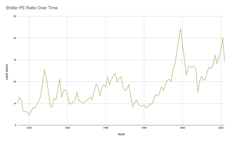
One of the main calculations used to assess if the market is fairly valued? The Shiller P/E ratio (stands for “price to earnings”), which basically does a 10-year lookback of prices divided by earnings.
While some have called into question the validity of this measure as it looks backward, not forward, it’s generally accepted as one of the strongest metrics we have to analyze valuations. I’m going to use the S&P 500 since it’s the most popular benchmark.
Moreover, since we’re less concerned with the validity overall of the Shiller P/E ratio as a means of judging valuations and more concerned with how current P/E ratios compare to those of the past, it should still be a good relative benchmark for whether or not we’re in ~precedented~ times.
Check this out (I pulled this data from here and then ported it into a spreadsheet so I could look at it over time against our other factors):
“Yes, valuations are high when compared to the 20th century, but—and this is my subjective assessment—not unprecedented in the truest sense of the word. ”
At the time of this writing (June 2022), the Shiller P/E ratio for the S&P 500 is 29.17. In May when I pulled it, it was 32.46. The average Shiller PE ratio over the time period illustrated above is 16.94, so it’s probably safe to assume that “overvalued” is a fair characterization, though this source notes the long-term historic trend considered “fairly valued” is 20.1. We’re approximately one standard deviation above “fairly valued” right now, despite being 22% off all-time highs.
(Again, it bears repeating: We’re not trying to question the work of Nobel Prize-winning Yale economist Robert Shiller here. We’re just trying to understand how “now” compares to “before.”)
From looking at the chart, it’s certainly higher than the average but reminiscent of 2018 values. It’s quite a bit lower than the peak around the Dotcom Bubble (which appears to have hit 42.91).
My major takeaway: Yes, valuations are high when compared to the 20th century, but—and this is my subjective assessment—not unprecedented in the truest sense of the word.
I didn’t look at this chart and think, “Oh my God, I’m getting out of the S&P 500 right away!” but I did think, All right, this is…potentially another indicator that diversification outside of Large Cap Growth is sensible.
If domestic Large Cap Growth is technically overpriced from a historical perspective using this measure, then I’m thinking: OK, it’s not “cheap” right now. Let me make sure I’ve got exposure to indices that track other stuff, too. (This is my approach always, but perhaps even more so when valuations on the Big Boiz are overpriced.)
The hard part about shaping your decision-making around single metrics like the Shiller PE ratio alone, though, is that it’s not a crystal ball. While it’s true we typically see high PE ratios associated with bubbles (and subsequent corrections), it is cyclical, and the data indicates it’s better for investors to hold on through the market cycle instead of attempting to time entry and exit.
As Two Centuries Investments puts it, “CAPE cycles are mean-reverting. However, this mean reversion does not only occur as a result of crashing market prices, it can also result from periods of modest market returns where earnings growth catches up and restores the valuation multiple. This second outcome is one of the reasons why selling stocks altogether leads to missed compounding. The other reason is that valuation ratios get you in and out too early.”
To put it bluntly: History may not repeat itself, but it certainly rhymes.
Cool—so there’s that. S&P 500 overvalued? Yep. Anything you can or should do about this one? Unclear. So what’s next?
Low interest rate environments (as measured by treasury bond returns).
As a reminder, people in the financial independence world worry about low interest rate environments because it impacts bond yields, which are the #SturdyGurl lynchpin of the 4% rule. While I’ve done an episode about the 4% rule in the past and addressed these concerns specifically, they’re still helpful for this analysis. pushes glasses back up nose
Since most of the data we use to support things like the 4% guideline for safe withdrawals goes back to the 1920s, it seemed important to look back that far—it was hard to find stuff on major websites much older than the 1960s, but fear not, dear Freaks in the Sheets, I prevailed. I found this sketchy back-alley website (OK, that’s not fair—it was the NYU Stern School of Business site that just looks like it’s from the 1920s), downloaded the data set, and found this: A funky, sharp bell curve of 10-year T-bond returns.

“Confirmed: 10-year t-bond yields are unprecedentedly low in recent years.”
Right now, it appears that we’re at the end of a downward trend that is lower than it’s ever been before. The average t-bond return in this data set is 4.8%; right now, we’re sitting at around 1.51% (as of 2021).
So confirmation of our second bias appears to be clear: We’re in a lower interest rate environment for 10-year treasury bonds than we’ve been in before, though it’s interesting to see this chart plotted all the way back to the 20s when one considers that we often see the chart “start” in the 70s and appear to be a perilous drop downward.
The last decade appears to be a rough mirror image of, say, rates in the 1940s.
Here’s the thing, though: If we’re to believe the Fed, then these should begin going up. It’s not like it’s been multiple decades since we’ve seen higher yields. As recently as 2006, the rate was 4.7%.
It’s worth asking: Do we need to treat bonds differently in a 2022 portfolio than in a 1992 portfolio? Are our “old faithful” #SturdyGurl bonds not as deserving of a spot in our portfolio? It’s been argued that the Fed’s actions have forced people into alternative assets (like real estate) and driven housing inequality, and when you see bond yields hitting historic lows, it’s compelling.
Cool—so we’ve confirmed t-bond yields are unprecedentedly low in recent years.
What’s left?
High inflation as measured by the consumer price index.
Ah, yes. Good ole’ inflaish. Everyone’s favorite dinner party topic of conversation!
I’ll let this one speak for itself:

Hm. So we’re in a recent inflation high, but if someone showed me this chart without any other context, I’d think whatever it was measuring had been going down, for the most part.
This highlights a limitation of all of this “let’s examine the historical context” stuff—it’s not predictive. It doesn’t tell us where we’re heading, just where we’ve been. And while it’s good for making us understand whether or not what we’re experiencing now has ever happened before, it’s not good for indicating what’s going to happen next.
So what happens when we map all three of these factors onto the same chart?
Let’s get naughty and commit some chaotic chart crime by indiscriminately layering these lines on top of each other despite the fact they’re measured with different metrics and enraging sophisticated data scientists everywhere:
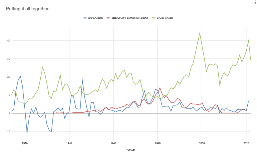
THE HORROR!
Please excuse my egregious plotting things measured by different metrics on the same graph. Forgive me, data gods, for I have sinned.
But I wanted to be able to look at all three of these things (relative to their histories) and see if we’ve had relatively high inflation, overall low bond returns, and relatively high CAPE ratios simultaneously before.
The periods that most closely resemble the period we’re in now?
Well, the ‘40s, for one thing: High relative inflation and low-ish bond yields, but technically undervalued CAPE ratios. And the late ‘90s: When we had similar CAPE ratios, but slightly higher bond yields and lower inflation.
So my experiment nets an interesting outcome…
We’ve never been in a period exactly like this one if you consider current inflation, bond yields, and CAPE ratios occurring at the same time…
...but each variable on its own is not unprecedented, with the exception of the bond yields, which have been at historical lows in 2020 and 2021.
(Though, I’d take this time to remind us all: Rates were low for a reason. Our global panorama created a lot of unexpected economic strain on our system that didn’t stem from businesses making bad decisions or consumers’ changing preferences, for what it’s worth.)
My general takeaway after spending an embarrassing amount of time tinkering in my little data set with rogue chart creation was that, Yeah, things are a little haywire right now, but this doesn’t look drastically more concerning than other turbulent times in the past (or periods with much higher inflation and low valuations from crashes).
It’s clear that the economy and markets can’t continue on this way, but I don’t see any reason why we can’t return to more realistic valuations, raise rates (and by extension, bond yields) slowly, and ride out the (still historically low) inflation while the kinks in the post-pandemic world get worked out.
Maybe I’m just a dumb optimist, but I don’t know that I’d classify the severity of our current situation as any “worse” or “different” from the past. Because: History rhymes.